Which is a blatant lie. It's a Leica Boutique cabinet - it looks the same as the Leica Boutique cabinet in the Stirling Street store. Which looks the same as the Leica Boutique cabinets in Tokyo, Singapore, Sydney, and probably every other major city in the world. Black MDF cabinet, red interior, red dot on top.
Leica are smart people - and I am not talking just about the cameras and lenses and binoculars...they are smart with their branding. They realised early on that they had a name that was worth putting on a banner and were careful to cut the banner the same size for everywhere and put it on the same pole. As a business strategy, it is akin to a national government deciding on a flag and making sure that it is seen everywhere. It re-enforces loyalty, and in this case it re-enforces the sort of loyalty that the customers actually want to pay for.
Brilliant.
Of course, each manufacturer has a characteristic colour combination, and you'll see that used in advertising and signage. The more adventurous ones have a bright colour that attracts the eye so that people snap to their displays in the shops. These days, they can repeat the hue on their packaging so that every discarded box becomes a free billboard. If they are bold they can make a logo physically bigger on the packaging or...gasp...on the product itself.
It can backfire...think back to the Minolta logo when it got all arty in the 1990's and people were hard pressed to figure out what it actually was...and that also meant that they were confused as to who Minolta were*. You can surrender to the blandishments of the design department a little too early.
It can be too conservative - harking back to the design styles of the film eras can be dangerous too. There is a major maker that has several logos in operation right now dealing with different divisions of their overall company that could look at this aspect - some of the brand presentation looks decidedly 1970's. It might be argued that the division of business that they are dealing with also harks back to the 1970's so the buyers of the goods would not be influenced by a modern logo. Perhaps this is the case, but I am glad to see that they have adopted a far more stylish nameplate for their newer cameras and lenses.
But they did not choose a bright colour combination. It will remain to be seen if their presentation can grab the casual shopper's eye.
Well, back to the Leica Boutique. The Murray Street shop walls are now complete and the stock that you see in there will be designed to appeal to the high-end buyer. I noted that the titanium M kit was there this week. Pick one up on the way home from the office...And there are no end of lenses that will be making an appearance.

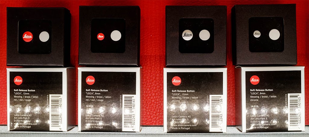
One particularly attractive bit was on the island display - and you need not spend the annual budget of Brazil to buy it. If you are a Leica shooter treat yourself to an oversize shutter release button in one of a number of styles. They screw into the shutter button as it currently exists and make for smooth and comfortable shooting. I use one on a camera when I am doing waist-level shots at car show. I press it with my thumb and the shots are rock-steady.
* To be fair, a lot of people couldn't stop themselves from calling it " Minololta ".